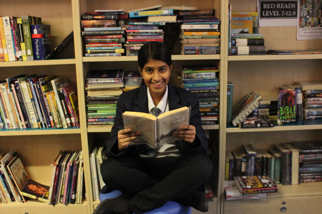
'Make The Ordinary Extraordinary' - Surrealism.
Weird and wonderful for me is surrealism. Surreal photos are disorienting, hallucinatory quality of a dream. It is a very creative style of photography and it is unreal. My definition of surrealism is creating things that would never happen in real life. The unimaginable. I wanted to do this topic because I like being creative, It seems fun and interesting. With this topic I want to create photos that are so weird and surreal. Surreal pictures are captivating it is something we could never experience, I want the viewers to interpret what I am trying to convey through my work.


Artist Research
Tommy Ingberg: Tommy Ingberg is a photographer and visual artist, born 1980 in Sweden. He works with photography and digital image editing and he creates surreal photo montages dealing with human nature, feelings and thoughts. Tommy says, "For me, surrealism is about trying to explain something abstract like a feeling or a thought, expressing the subconscious with a picture. For my work I use my own inner life, thoughts and feelings as seeds to my pictures. In that sense the work is very personal, almost like a visual diary". During the last couple of years he has received international recognition with his work and he has won awards from many different competitions including International Photography Awards, 'Prix De La Photographie Paris, and Sony World Photography Awards. In 2012 Tommy won the Lumen Prize with his picture “Torn”. His photography is mostly black and white which I really like as it creates quite a dark and mysterious feeling.


Analysis:

I really like this photo of Tommy's because I really like the message behind it. I think that the meaning behind the photo is that you should not let anybody keep you down or step all over you. I also like how the photo is black and white I think it creates quite a dark and mysterious affect. Additionally I like the background of the photo with the clouds. I think that the exposure is just right for the photo and although there are not many shapes in the photo I like how the photo is nice and simple. In my opinion I think that the photo has quite a rough texture to it and the only pattern in the photo is the black and white colours. Overall I think that this photo is really clever and I really like it.

This is another photo of Tommy's that I really like. Firstly I like how weird and surreal the photo is. It almost looks like he is flying off as the balloons are lifting him up and he is getting ready to fly. I also like how mysterious the background of the photo is, the fog creates a peculiar scene. As you can tell all of his photos all have a similar theme and that is that they are all black and white photos which again creates that dull and secretive feeling in his photos which I really like. I think he has the perfect exposure and angle. Also in the photo there are quite a few different shapes from the balloons and the hills which I also really like. Overall this photo is really good and I like it a lot.
Erick Johansson: Erik Johansson is a photographer from Sweden and he is now based in Prague, Czech Republic and Sweden. He is working on both personal and commissioned projects with clients all around the world. Erik says that he "doesn't capture moments, he captures ideas". With the help of his camera and Photoshop the goal is to make it look as realistic as possible yet surreal. He was born in April 1985 and he grew up on a farm with his parents and two younger sisters. Erick has always loved the draw as his grandmother was a painter and then after a while he gained an interest in computers. When he was 15 he got his very first digital camera and that is when his career started. He said that he felt quite strange to when he took a photo as it wasn't the process of creating something in the same way as drawing. He started playing around with trying to make something that you could not capture on a camera and that is how is interest in photo manipulation started and after many years it became his profession.


Analysis:

I really like this photo of Erick's. Firstly I really like how the photo is quite dark yet you get the subtle bits of light coming through, it creates this calm and peaceful feeling. I also like how you can see some raindrops sliding down and how he has put the house and the rest of it into a bottle. As it is in the water it reminds me of how people used to send messages in a a bottle along the water. Everything is in focus and the photo has a large depth of field so you can see the different parts of the image. This photo really stands out and it captures my attention. Overall I really like the photo as it is very beautiful.

This is my second favourite photo of Erick's. Firstly I think that his exposure and angle is just right for the photo. The thing I like most about this photo is how amazing his photoshop skills are, he creates amazing, surreal photos by using photoshop. I love how there is a shimmery, shiny sunlight coming through from the top of the photo, it creates a very happy feeling. I also like how the clouds are underneath, they look so soft and fluffy which adds to the happy feeling. I like how the photo is colorful and how the house is flying away and if you look closely you can see something that looks like a shadow coming out from it down below. Overall this photo is really good and I like it.
Salavador Dali: Salvador is not a photographer he is an artists however the reason I have chosen him as one of my artist's is because I love his clock work surreal painting and I want to try something like this however instead of painting or drawing I will be using photos and photoshop. He was born on May 11th 1904 and he was highly imaginative. Dalí attended drawing school in 1916 and he also discovered modern painting on a summer holiday to Cadaqués. The next year, his father organized an exhibition of his charcoal drawings in their family home.In 1922, Dalí started school at the Academia de San Fernando in Madrid. He stayed at the school's student residence and soon brought his eccentricity to a new level. During this time, he was influenced by several different artistic styles, including Metaphysics and Cubism. Whilst he was in school, he began exploring many forms of art including classical painters like Raphael, Bronzino and Diego Velázquez. The Dada philosophy influenced his work throughout his entire life and helped him produce amazing pieces of work.


Analysis:

This is one of my favorite piece of Salvador's. Firstly I really like the colours that are in the painting, as they are quite warm colours the makes the person feel quite calm, peaceful and happy. I also like how he has painted the clocks. I like how all of the clocks are melting. This collection is called the persistence of memory and he dreamed of clocks melting and this is what he created. An interpretation of this piece of art is that things that appear strong and always purposeful come to a point where they fade away and become somehow useless. I really like this painting as it is very creative.

I also really love this painting of Dali's. The melting and distorted clocks symbolize the unpredictable passage of time that we experience while dreaming. This painting has a very photographic quality to it which fits well to his description of his art as being 'hand-painted dream photographs'. The reason I like this painting is because of how much it looks like a photo and how all the colours burst off the page creating some sort of explosion. The clocks melting show that they lose their power and stability over the world around them. I really like this piece of art and all of his other clock pieces.
Plan For Shoot 1:
Main Idea: My main idea is to take a picture of an egg and to change the yolk of the egg into an eye
Props: egg, white background and a model
Background/colour: A plain white background so that the egg stands out
Shutter speed: Fast shutter speed.
Exposure: 0
Aperture: Medium aperture (F15)
Angle: Try different angles to see which one looks the best.
Props: egg, white background and a model
Background/colour: A plain white background so that the egg stands out
Shutter speed: Fast shutter speed.
Exposure: 0
Aperture: Medium aperture (F15)
Angle: Try different angles to see which one looks the best.
Shoot 1:


Worst Photo:

In my opinion this is the worst photo from my first shoot. The reason it is the worst is because firstly the photo is quite out of focus, you can not really see the eye clearly, I also think that the photo might be too zoomed in and that is why it has came out quite out of focus. Also the photo looks as if it could of been a little bit under exposed as it is a little bit dark and it looks like as if the camera was shaking a little bit whilst I was taking the photo. I do not think that this photo is successful because I will not be able to use it in the editing as it is not clear so it would not look good.
Best Photo:

In my opinion I could not get any great pictures of an egg because it is a little bit simple but I think that this one is the best one I took because firstly the photo is very clear and you can see everything from the yolk to the egg shells. I also like how the egg shells have created a little faint shadow and I also like how the shells are placed so it looks like the egg has just came pouring out. Also I think that the plain white background makes it stand out more and I think that the exposure and the angle of the photo is just right. This photo is successful as I will be able to use it in the photoshop editing process to create my final photo for this shoot.
Photoshop Editing Process:


Firstly I had to get the iris of the eye separated, I tried 3 different things firstly I tried the magnetic lasso tool but I could not get it to be neat as it kept going quite messy and selecting the wrong thing so then I tried to rub it out but that ended with it being all messy and also it did not look realistic enough. So finally I then decided to use the elliptical marquee tool which let me create a circle around the eye and then take it out; this was so much better because it made the iris look neat and smooth and it selected the right part. I then made the image of the eye bigger by also pressing shift so it would not go out of focus so that I could place it on top of the yolk. Finally I added a little reflection on the top of the iris.
Final Photo:

The photo above is the final photo for my first shoot. I think that this photo is pretty good as it goes with my theme of surrealism and it looks quite creepy and weird which I like. Firstly I like how it looks like the egg and the eye has just came pouring out of the shell which makes it look very weird. I also like the little bit of reflection on top of the iris. The eye looks like it is constantly staring at you which makes you feel quite intimidated and scared. I think that the editing is okay as well. The photo is not great however it is okay for a first shoot.
Plan For Shoot 2:
Main Idea: My main idea is to take a picture of a book with a pair of glasses on top of it and then in the glasses put somebody in them who is reading a book.
Props: Model, glasses and a book.
Background/colour: A library background so it matches the theme of my idea.
Shutter speed: Fast shutter speed.
Exposure: 0
Aperture: Medium aperture (F15)
Angle: Try different angles to see which one looks the best.
Props: Model, glasses and a book.
Background/colour: A library background so it matches the theme of my idea.
Shutter speed: Fast shutter speed.
Exposure: 0
Aperture: Medium aperture (F15)
Angle: Try different angles to see which one looks the best.
Shoot 2:


Worst Photo:

In my opinion this is the worst photo from my second shoot. Firstly the photo seems to be quite out of focus so I will be unable to use this for when I edit the photo. Also the photo is too far out, it needed to be more zoomed in so that you could clearly see the person and the book. Furthermore I think that the angle of the photo seems to be a little bit bent so the photo needed to be more straight on. I think that the camera might have been shaking when I took the photo as well. Overall this photo is not good and I will not be able to use it for my final photo.
Best Photo:

The photo in this shoot are not exactly interesting as they are pretty simple however this photo is the best of my second shoot. Firstly the photo is in focus so you can clearly see the book and glasses. I also like how the background of the photo is a little bit out of focus so that the main focus is on the glasses and the book. There are a lot of different shapes in the photo which makes the photo look a little bit better and the colours in the photo are quite similar so they blend together so it makes the photo look better. You can also see a tiny shadow on the book coming from the glasses. Overall this photo is pretty good and I will be able to use it in my editing process.
Photoshop Editing Process:
The photoshop editing process for this shoot was pretty simple and easy. The first thing I had to do was use the magnetic lasso tool to go all around the person and select them. Then I dragged the person onto the book layer. What I had to next was I had to make the person smaller by holding shift whilst I did it so that it would not go out of focus. I then placed the person in the lens of the glasses. I tried to lower the opacity but that did not look good so I left it the way it was.


Final Photo:

The photo above is my final photo for my shoot 2. I think that this photo is pretty good as it goes with my theme of surrealism. I like how the photo is pretty ironic and I like the idea behind the photo. Firstly I like how you can clearly see the person reading in the glasses. I also like how to background of the photo relates to the main focus/ actual idea of the photo. In my opinion this photo is an improvement from my first shoot. I also like how simple yet effective the photo is; the photo is simple yet it makes people stop and wonder what it is and what is going on in the photo.
Plan For Shoot 3:
Main Idea: My main idea is to take a picture of person and to make their face look like crumpled up paper.
Props: Model and paper.
Background/colour: A plain background.
Shutter speed: Fast shutter speed.
Exposure: 0
Aperture: Medium aperture (F15)
Angle: Try different angles to see which one looks the best.
Props: Model and paper.
Background/colour: A plain background.
Shutter speed: Fast shutter speed.
Exposure: 0
Aperture: Medium aperture (F15)
Angle: Try different angles to see which one looks the best.
Shoot 3:


Worst Photo:
|
Shoot 3 did not require a lot of photos however this is the worst photo from shoot 3. Firstly I believe that the photo is very out of focus. The photo looks very shaky and this maybe because the camera was shaking whilst I was taking this photo. Also I do not think that you can clearly see his face and the photo is tiny bit too zoomed in, I think that I needed to take the photo from a little bit further back. In my opinion I also think that the person is a little bit too the right and that they should of been standing more in the middle. This photo is not very good and I will not be able to use it to create my final photo.
|
Best Photo:

|
In my opinion this is the best photo from my third shoot even though all the photos very very simple. Firstly the photo is very clear as you can clearly see the person face and it is also in focus. The background is just plain which allows the focus to just be on the person which is good. This photo is also successful as I will be able to use it to create my final photo for shoot 3.
|
Photoshop Editing Process:
The first thing I did was I selected the paper and I placed it over the person. Then I started to blend the paper into the person's face using different tools like the clone tool and the rubber and I changed the colour of the paper. I did that 3 times and did it in different sections. I then rubbed out some of the edges and places the paper as the background.


Final Photo:
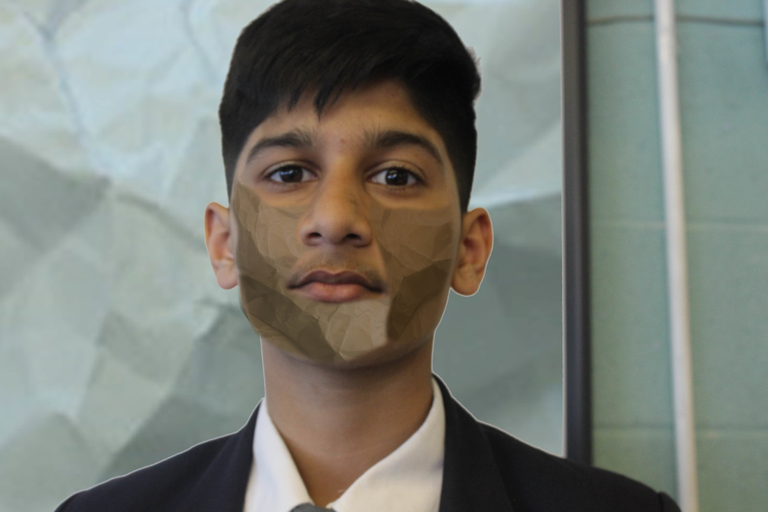
The photo above is my final photo for shoot 3. In my opinion I do not think that the photo is extremely good and I think I could of done better. However I do like the whole concept behind the photo and that the crumpled paper could maybe represent how he feels shattered from the inside and how he is trying to hide it. I also like how weird and bizarre the photo looks as this fits with my main theme of surrealism. The photo is different and it does make people stop to look at it.
Plan For Shoot 4:
Main Idea: My main idea is to take a picture of somebody standing on some books and make it look like they are about to take off and start flying.
Props: Model and books.
Background/colour: A grass outdoor background.
Shutter speed: Fast shutter speed.
Exposure: 0
Aperture: Medium aperture (F15)
Angle: Try different angles to see which one looks the best.
Props: Model and books.
Background/colour: A grass outdoor background.
Shutter speed: Fast shutter speed.
Exposure: 0
Aperture: Medium aperture (F15)
Angle: Try different angles to see which one looks the best.
Shoot 4:


Worst Photo:
In my opinion this is the worst photo from my fourth shoot because firstly as you can probably see the photo does seem to look a little bit out of focus. Also the end book has been slightly cut off so I needed to push the books a little bit further along. Also I think that the angle of the photo is a little bit wrong as it needed to be a little bit more straight. Additionally to make it look like the person is flying/floating it would of been better if they were standing on their tip toes which they have not in this specific photo.
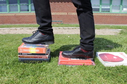
Best Photo:

n my opinion this was the best photo from this shoot because firstly the angle of the photo is great for the photo, it is at a worms eye view which makes it easier to see what is going on in the photo and also unlike my worst photo you are able to see all of the books and nothing is cut off. The exposure in my opinion is just right for the photo as it is not to dark nor to light. I also like how you can see the persons shadow and this give me an idea to add shadows off the books when editing to make the final photo look even better. Furthermore I like how the person is on their tip toes as it makes it look more realistic. This photo is the best as it would be perfect to use in the editing process.
Photoshop Editing Process:
The editing process took a little while for this photo. Firstly I opened the photo and placed the other photo over it and using the tool I cut out some off the books from underneath. I then realised that you could see a square on the grass so I had to use the rubber and cloning tool to blend it all together and make it look more realistic. I added a shadow to the sets of books and I played around with the angle and distance of the shadow to get the perfect shadow for the books. I then softened parts of the photo as some parts were a little bit harsh.


Final Photo 1:
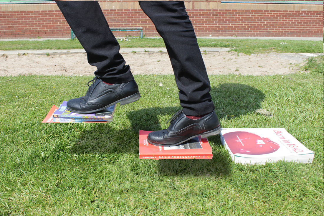
This is my first final photo for shoot 4. I really like this shoot as it fits really well with my theme of surrealism. You can clearly see that the person is using the books like steps and how the books seem to be almost floating in the air. I also really like the shadows of the books in the photo as it makes the photo look even more better and more interesting. It looks as if the person is about to start flying now.
Final Photo 2:
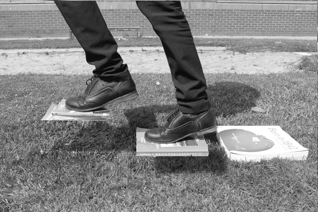
This is my second final photo for shoot 4 the only difference from this photo to the other one is that this one is in black and white. The reason I have turned it into black and white (using CTRL SHIFT U) is so that it links to my first artist Tommy Ingberg. As you can see all of his photos are mostly in black and white so I decided to turn this one into black and white. I think the black and white effect creates more mysterious and curiosity in the photo and makes it looks a lot better and I really like this version a little bit more than the colored one.
Shoot 5:


Worst Photo:

In my opinion I believe that this is the worst photo from my fifth shoot. As you can clearly tell the photo is very under exposed as it is way too dark and dull which makes you almost feel quite depressed. Additionally the photo is very out of focus as I did not adjust the focus point on the camera. Furthermore the angle of the photo is all wrong, the person needed to be right in the middle of the white background and I was standing on the wrong place whilst taking the photo as well. This photo is very unsuccessful and I will not be able to use in the photoshop editing process.
Best Photo:
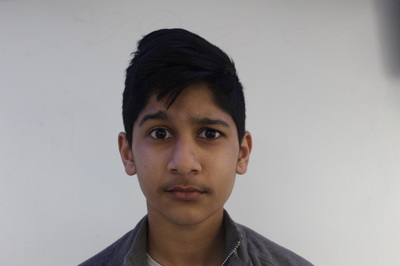
In my opinion I believe that this is the best one from my fifth shoot. Everything that was wrong in my worst photo is all correct in this photo. Firstly the angle of the photo is perfect, the person is right in the middle of the white background and I took the photo from the right angle. Also the photo was taken at the perfect distance from the person so you are able to clearly see the persons face which will make it easier for me when I start the photoshop editing process. The person eyes are wide open as well which means the clock in the eyes will stand out even more. The photo is in focus and the exposure is just right for the photo. This photo is successful which is why I will use this one to edit it and create my final photo.
Photoshop Editing Process:
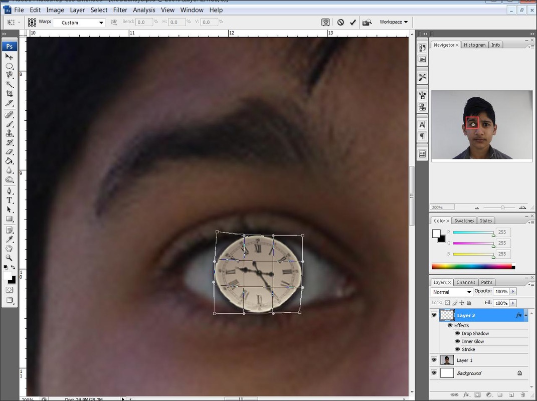
I decided that I was going to try to different edits with the photos. Firstly I opened both photos and then I used the elliptical tool to select the clock. I then dragged the clock over to the other side whilst holding SHIFT to make it smaller so that it does not go out of focus. I then placed it over the eye. I then added a drop shadow behind to eye to make it stand out more. Then finally for the first edit I lowered the opacity of the clock as it was a bit too strong and I put the whole Clock around his face and lowered the opacity once again. For the second edit I did the first bits the same but this time I move the whole entire clock on his face and used the warp tool to make it fit perfectly onto his face. Then I selected all of the white parts and deleted them so that you can just see the Roman numerals.


Final Photo 1:

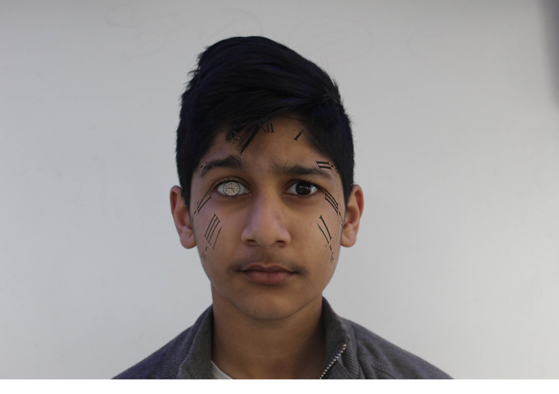
The photo above is my first final photo for shoot 6. I really like this photo as once again it links with surrealism and also I have used my artist Salvador Dali to help influence this pieces as he uses clocks in his work and I used his idea to apply it to my photography work to create this piece. I also like how I have used the clocks in this photo to repents time. Overall I think that this photo is good and I really like it.
Final Photo 2:
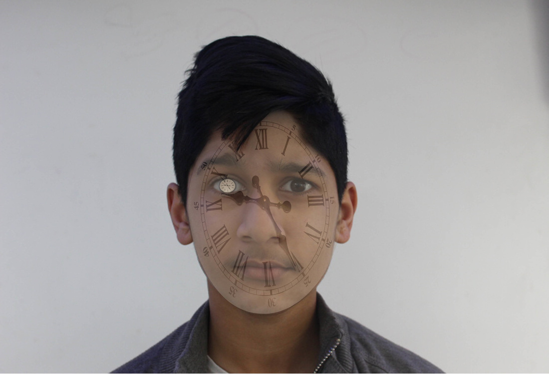
The photo above is my second final photo for shoot 5. I really like this photo as once again it links with surrealism and also I have used my artist Salvador Dali to help influence this pieces as he uses clocks in his work and I used his idea to apply it to my photography work to create this piece. This photo is very similar to the first one however this phone just has the roman numerals which I really like as it makes it more interesting yet it is still pretty simple. Overall this photo is really good and I like it.
My Most Successful Shoots:

|
|
