Campaign Photography For Racism:

In my opinion I find the message of the photo really strong. I think that the picture of the dog is supposed to represent how the colour of your skin does not matter, dogs can't see colour they can only see black and white so the photo I think means that colour should not matter. They have also used a sad dog, showing how most people in society are tired and upset that certain people are making racist comments about skin colour. The photographer used this in a very clever way and I really like how they thought about how to get the message across.
Campaign Photography For Anti Bullying:
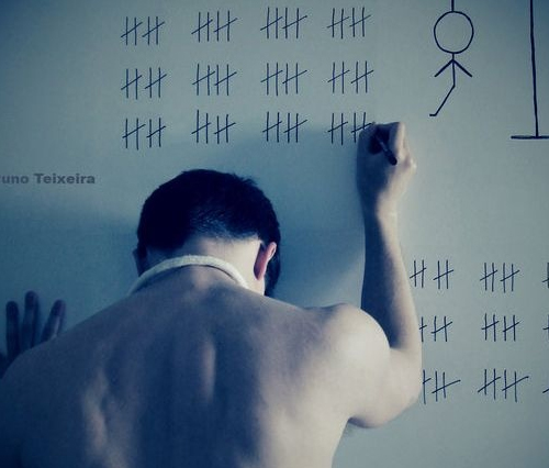
Through a photo you can get a lot of messages and emotions. I believe that in this photo the photographer wants to show how bullying can lead to potential suicide. The meaning that I am getting through the picture is that the person is playing hang man with himself, it is like he is counting the days until he commits suicide, the rope on his neck suggests that is what he is planning. The photographer has sucked out all the colour, sometimes colour can be distracting to a photo so making the photo black and white will make the image much stronger and more realistic. It looks like the photographer has used a blue flitter effect and the lighting looks like it is falsely lit to create a dark and gloomy effect. It also looks as if the photo was taken on a wall maybe in his bedroom. overall I think that the photo is really strong for the campaign as it is showing what bullying could lead to.

This photo represents cyber bullying. I find the context of the photo quite deep, you can clearly tell that the photo shows a young girl being bullied online. The arm coming out of the laptop has a strong meaning to it, it shows that words can hurt and people potentially start to self harm themselves. To create the effect of the arm the photographer would of had to take two separate photos and then merge them together on Photoshop. The composition of the photo is strong, there is nothing behind the laptop but on the other side there is a shadow. The shadow can represent darkness and loneliness, it could also mean that nobody knows about this, it is behind closed doors. The photo is black and white I think the photographer did this to show the actual emotions of the girl, lonely, depressed, sad. In my opinion I would maybe add a little colour, a colour on the opposite of the colour wheel so that it catches the viewers eye. If you were able to touch the picture you would probably feel pain and anxiety as bullying is not something people enjoy.
Campaign Photography For Drink Driving:

This photo represents drink driving. I find the context of the photo quite deep, you can clearly tell that the photo represents the dangers of drink driving. The arm that is punching the person has a strong meaning to it, it shows when you drink and drive you can destroy and hurt a person and potentially take their life from them. I think that the cars in the photo all work very well together as they blend and the cars stand out even more as they are in a bright colour which can draw somebody's attention to the poster. The composition of the photo is strong and I like how the background is just plain simple as it helps to focus the viewers attention onto the actual message of the photo. The colours also give the photo quite a scary feeling as it is a scary message In my opinion I would maybe make the text more bigger and change the font so it stands out more to get the message across more as it is a bit difficult to see the text. If you were able to touch the picture you would probably feel pain and anxiety as drink driving is serious and scary issue.
My Campaign:
My campaign photography has 2 topics linked together. I wanted to link the topics together because I thought this way it will broaden my ideas and it is a higher level of thinking. The topics that I have chosen are bullying and suicide/self harm. I am very passionate about these topics and I want to show people how bullying could lead to potential suicide.
Plan - Shoot 1:
Main Idea: My main idea is for somebody to be sitting in a chair with their head down with a knife in their hand
Message: To show how words can hurt and how bullying could lead to suicide.
Props: Knife and a model.
Background/colour: A plain background and the photo will be black and white to be more effective.
Shutter speed: Fast shutter speed.
Exposure: 0
Aperture: Medium aperture (F15)
Angle: Try different angles to see which one looks the best.
Shoot 1:

For my shot 1 I wanted to try and take a photo in the style of the photographer. The photo on the left is the photographer's photo and their photography inspired me to do something similar but with my own twist. As you can see the arm coming out of the laptop is done by photoshop so I decide to use photoshop to add thought bubbles. The photographer photo made me think about how people say things to people and how they want to commit suicide so I used the photographer's photo to help me add my own twist to get the message across to the the viewer.


Best Photo:

My shoot 1 was not very good , I did not really like it. This photo is probably the best because you can see the blade in her hand which represents self harm. Also the background is black so the main focus is on the person which is good. Furthermore, it is in focus and I think the angle is right as you can see everything. The exposure of the photo is just right for the photo as well. I think this photo is okay however to make it better I needed to get the message across more.
Worst Photo:

This is the worst photo of my first shoot. The angle is wrong because the black background is not fully shown you can see where it ends. Also you cannot really see the blood on the hand or the blade. The blood does not look realistic it is too runny. If I was to do this shoot again and make it better I will use photoshop to add text to show that she is being bullied and make the blood look more real and try do a close up to get everything in the photo.
Plan - Shoot 2:
Main Idea: For this shoot I want to try and make it a poster so I can experiment with different types of text and photoshop techniques.
Message: I want to show how when people get bullied, the bullies words stay with them like shadows.
Props: Camera and a model
Photoshop: On photoshop I am going to use shadows pointing at one person and add text saying 'bullies are like shadows they never leave you alone'.
Shutter speed: Fast
Exposure: 0
Aperture: Medium
Angle: Straight angle
Shoot 2


Worst Photo Original

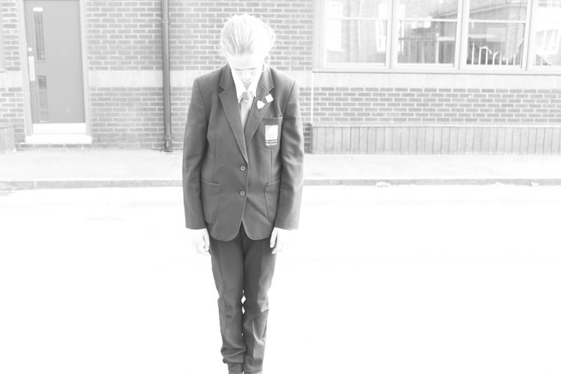
I think this photo is the worst out of my shoot 2 because firstly the photo is too over exposed. Also she is looking down which is not good because for my photo to work I need her to be looking directly at the camera. Furthermore, I think I should of zoomed in more to get a better close up to use when I edit my work.

I believe that this photo is the worst from the shadow takes because firstly the person is not pointing in the right direction so I would not be able to use it for my photoshop editing. Also you cannot see the person face which is not good. Furthermore I should of took it from a different angle to make it look like they are pointing at something.
Worst Photo Photoshop

In my opinion this is the worst photoshop photo because firstly the cloning of the background went wrong it cloned the shadows as well, so there were half shadows coming out of everywhere. Also some of the cloning went on to the shadows so the shadows have some of the ground on them. Furthermore there are tow heads which does not make sense and some of the arm got rubbed off. I think I should add some text to make it look like a poster
Best Photo Original

In my opinion I think that this is the best from my original shoot because the photo is in focus and the angle is good because she is directly looking at the camera. Also she looks sad which is good because she needs to look like she is being bullied. Her face is very clear and shows a lot of emotions. I think the lighting is right as well because it is not to bright or dark. This photo is successful as I can use it for my final photo for shoot 2.

This is the best photo from my shadow takes because firstly it is a good and clear angle, you can see that the person is pointing at something and the arm on the stomach looks like he is laughing at something as well; this represents that the victim is being laughed at. Also the colour and texture is the same has to other shadow photos so when I use photoshop to clone it, it will look the same.
Photoshop: An Overview Of The Editing Process


I had to do a lot of editing to make the photo look good. Firstly I tried to cut out the shadow using the magnetic tool, however, when I did it, it did not look like a shadow. I had to think of a different way so I decided to put all the shadows on one page and spread them out on the page. Using the transform tool I rotated, skewed and scaled all the shadows so they looked like they were pointing at something. Then I had to use the cloning and smudge tool to blend all the colours together to create the background. I uploaded to photo of the victim and placed in the middle so all the shadows were pointing at her. I decided to add text to show it look like a poster. Firstly I tried a normal font with just a black colour but I thought it did not look good. I then decided to experiment with the texts and colours and for the text colour I used the colour but made it a bit darker. Then I put it in all capitals and used the shadow effect to make it look better because after all my theme is shadows.
Best Photo - Photoshop
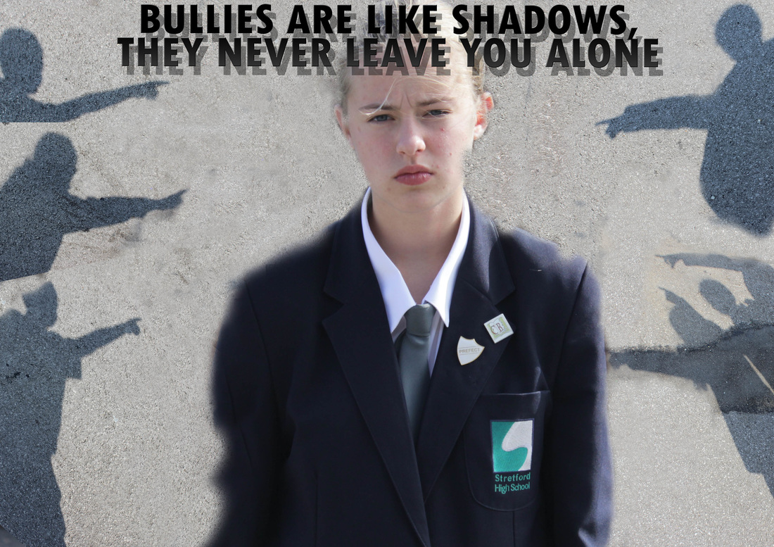
In my opinion I think that this is the best photo out of all of them. Firstly, the victim is directly looking at the camera so the angle is right and she looks sad and depressed. Through the use of the cloning tool I have managed to achieve an even background texture that looks authentic. I have used shadows as the bullies in this image because often bullies are faceless individuals who the victim is scared to name. The text I have used in the image drives the anti bullying message home and I like how the text has shadows as well like the rest of the photo.
Plan - Shoot 3
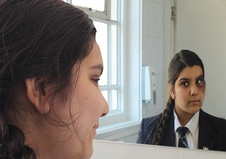
Main Idea: Have a person looking into the mirror smiling and then take another photo with bruisers and the person. On photoshop swap both images so that the smiling person is now looking at the bruised person in the mirror reflection.
Message: .This photo represents how bullying can drive somebody to do something/ think something of themselves.
Props: Model and red paint
Photoshop: On photoshop swap both images so that the smiling person is now looking at the bruised person in the mirror reflection
Shutter speed: Fast shutter speed.
Exposure: 0
Aperture: Medium aperture (F15)
Angle: Try different angles to see which one looks the best.
Shoot 3:


Worst Photo: Original

This photo is the worst photo from the shoot. Firstly the photo is under exposed it is really dull and dark, you cannot see the reflection or the bruise. Also the angle is wrong, I should of taken it from a side angle so that you can see the bruise and reflection. This photo does not show any type of emotions or meaning so the viewer cannot understand what is happening.
Worst Photo: Photoshop
I think this photo is okay however I think it is too zoomed in and also it does not look as realistic as the plait is on the wrong side . The photo would be better if I made it darker or made the photo black and white. Finally I think the reflection should be switched so that the happy face is the reflection.
Best Photo: Original

I really like the shoot and it portrays the initial meaning behind it. This photo I think is the best as it is in focus you can clearly see the person and her reflection in the mirror. You can clearly see her smile which is a key point as I needed it for the editing process. I think the angle is right and when I use photoshop to edit it you will be able to clearly see the real meaning behind the photo. I think the exposure is just right, it is not too light or too dark.
Photoshop: An Overview Of The Editing Process
On photoshop I decided to make the photo better by swapping the bruised face and the happy face to represent how her life was once good but now she is being bullied it is now bad. Firstly I tried putting the bruised face in the reflection but that did not look as realistic so I decided to swap them around. I had to open both photos and then put them on the same page. I had to crop some bits of the photo out so it looked real. I had an issue with the colour of the tiles, you could tell they were lighter and darker. I had to use the smudge tool to blend the colours in so it looked better. I then decided I wanted to make the photo black and white so I tried different colours to see which looked best. I thought it would be a good idea if I made half the photo black and white to show how her life is sad and the other side use colour to show how it was happy. I used the magnetic lasso tool to select the part I wanted to be black and white. I tried adding text however when I did it did not look that good and I thought the photo would be effective without it anyway.


Best Photo: Photoshop

The photo above is my first final photo for my final shoot. I really like this shoot as I like the message behind it, this photo represents how bullying can drive somebody to do something/think something of themselves. The person is now looking in the mirror at her former self when she was so full of life and happy and now because of the bullying she is depressed and sad. The bruise on her face also helps to get the message across that she is being bullied. I think that the editing of the photo is good and the lighting and angle is good. Overall I really like this photo.

The photo above is my second final photo for my final shoot. I have used the same photo however I wanted to make it look like more of a poster. To do this I added some text and a bullying help line logo. I think that this made the photo look a lot better a it gets the message across more and it looks a lot better as a poster.
Some Of My Best Photos From Campaign Photography:


Evaluation:
I have really really enjoyed campaign photography, I think within this unit I have been able to show my photo shop skills a lot and I think I have thought of unique shoots which represent my theme which is bullying and self harm. Throughout my takes you are able to see how my photos have gone from bad to good. I think I have shown good progress. My first shoot was not good because I did not have any good ideas and also I did not look realistic. Take 2 and 3 was when my ideas began to develop and when I started to use photoshop to make my photos better and strengthen my photoshop skills. Throughout the whole campaign photography unit I have been able to improve my photoshop skills and I have been able think outside of the box when it comes to my ideas which has helped me improve my work and make good progress.
