What Is Mobile Photography?
Mobile photography is when you use a mobile phone, such as an iPhone to take photos. Mobile photography has its advantages and disadvantages the photos may not come out as well as they would on a digital camera but there are advantages to using mobile photography,like apps that allow you to edit the photo. You can edit things like colour, brightness and contrast, add effects and many more. All the apps that have been invented helps mobile photography to become very popular. Mobile photography allows you to do things that digital cameras might not be able to, people who may not have any experience with professional photography can always use mobile photography to achieve the photos they want.
Photo Editing Apps Review:

The first app that I have tried out is called Repix. Repix is a photo editor which allows you to add effects and many other things to your photos. All the tools are easily available for you to access. This app has many free features which allows you to explore and make your photos even better. These features include adding flares and rain drops to your photos, you also have many tools which will allow you to add different effects to your photos like charcoal, blur, fitter, edger, legacy and many more. Furthermore with Repix you can make your photo stand out even more using filters such as smoky, shuffle, denim and many more. In my opinion the best thing about this app is that you can do so much with your photos, add different effects, control the brightness, contrast and vibrance of the photo and also you can draw on more effects and it gives you the option of adding boarders. I think the bad side of the app is some of the effects you have to pay for and also it does not let you add text. Overall I would recommend this app for a gcse photography student because it is fun and easy to use and you can do so much to your photo.

The second app that I have tried is called InstaEditor. This app is also a photo editor which lets you to do many things with your photo. All the editing tools are easily available for you to test out . This app has many free features which allows you to try different things with your photo. The features include enhancing your photo with the enhance filter, adjusting brightness , crop, sharpened and contrast, filters like lucky, dean, key lime and many more, adding text and drawing and more. In my opinion the best thing about this app is you can add different effects, control the brightness, contrast and many others and also you can draw and you can blur out some parts of the photo, get rid of some of the colour in the photo and lots more. I think the bad side of the app is that there is not a lot of effects. Overall I would recommend this app for a gcse photography student because it is easy to use and it has most of the editing tools you need to edit a photo.

The last app I have tried is called photo lab. Photo lab is a photo editor which allows you to do many things to your photo. All the tools are easily available for you to access and you can click on a section and it will open up even more editing for example if you click on fancy filters it will open many filters like neon, matrix, edge detection and many more. This app has many mor free features. These features include filters, collages, lighting effects, text , backgrounds, sketches and many many more. In my opinion the best thing about this app is that you can do so much with your photos, add different effects, add boarders, create collages, enhance the photos, control brightness and sharpness and lots more. I think the bad side of the app is some of the effects you have to pay for and sometimes the effect does not come out like I thought it would. Overall I would and would not recommend this app for a gcse photography student. I would recommend it because there is a lot you can do with your photos however some of it is child like, meaning adding stickers and hats to your photo which I don't think is very good.
Artists Research.
Steve Mayes: Steve Mayes is a architectural and mobile photographer. He believes that it is his business and my passion. He wants his photography to capture that sense of place.He formed Steve Mayes Photography in 2002, after moving to the North East , he grew up in the Midlands. His interest in photography had been developing from trips around Europe and North America. He the. moved to Newcastle and whilst there he turned photography into a real passion. He started of his career by working with film and a darkroom, and even exclusively black and white for some years. Steve started to sell his photos in local shops and galleries, and through an online shop, he still does this as it is a important part of what he does. The North East has very much become his home. He lives in North Shields with his wife and his two daughters.


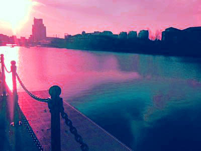
BEST PHOTO: This is one of my favorite pieces of his work. The picture shows a city landscape. The sky in the background creates the perfect calm and relaxing scene as it is very pink. Also you can slightly see the sunset which makes it look beautiful. I love the part of the photo were you can see the reflection of the clouds in the water and also the bridge is reflected so it looks like it is joined up. The composition of the photo is good as well. I think he has used the lights and colours very well to create the perfect picture.
Joas Souza: Joas Souza started his photography at an early age. His father is also a photographer and his mother is a architect this meant that he spent a lot of time surrounded by photographs and architectural projects, which contributed to his understanding of space, shapes and dimensions, as well as architects’ minds. Helping his vision and ability to capture every detail of each building that he photographs.His father’s photographic influence helped Joas to combine his understanding of architecture into photographs. He worked as professional photographer for 7 years in Brazil, taking photos for companies lol Ford Motors, Natuzzi and Petrobras, Joas decided to move to London in 2005. Joas has developed his work and talent, and he takes photos for renowned architects’ firms, interior designers, design agencies and real estate investors.


BEST PHOTO: I really like this photo because firstly I think that the angle is perfect for the photo; it is a bird's eye view which I think he has used so that he could capture all the lights and the buildings. Also I really like how he has captured all the lights which I think really make the photo come together. I think that the streaks of light on the road from the cars look really good. I think that the photo is taken at night so you get a 'city never sleeps feeling' from the photo.
Misho Baranovic: Misho is a mobile photographer. Misho's street photography has been exhibited internationally in New York , Berlin, Sarcelles, France and many other places. In 2012, Misho and Oliver Lang created the Instaburb book project, documenting Australian suburbia through Instagram. Besides being a photographer he is also a writer, Misho published his first eBook with Digital Photography School: iPhone Photography: How to Shoot, Edit and Share Great Photos. The eBook is a definitive guide on how to take creative control of the iPhone camera. Misho is available for teaching and speaking engagements. He has taught workshops on mobile street photography for the Monash Gallery of Art, NMIT, and EyeEm in Berlin. In 2013, Misho curated participatory photography shows like 'MobFORMAT'.


Best Photo: I really like this photo because firstly I think that the angle is perfect for the photo; it makes it a lot easier to capture the shadows in the photo. Also I really like how he has captured all the shadows and how there is a little bit of light coming through which I think really make the photo come together. I really like how he has used the use if shadows and light in this photograph. I think that the photo is taken mid evening and that is how maybe the photo is a bit dark and the light maybe coming from a lamp post.
Edges Starter Photos:


Worst Photo: In my opinion I believe that this is the worst photograph from my edges shot. First of all the edges in the photograph are not very clear and I think that the photo is too zoomed out. I also thunk that the photo is quite plain and boring as well. As the photo is too far out it makes the photo look a tony bit out of focus. Overall I think that this photograph is pretty bad and I do not like it.

BEST PHOTO: I think this is my best photo from the edges shoot. The photo was taken outside in the daytime. I like it because you can clearly see all of the edges from the gate, the yellow lines and the edges on the building behind. The edges give it a sharp texture. The light at the back of the photo is coming from the sun. I think the composition and angle is good as well.
Lowry:


Edited Photos:
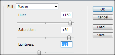
For these edited photos below I did not do that much to them. All I did was played around with the hue and saturation by either increasing or decreasing it and I also played around with the brightness and contrast by either increasing or decreasing it.


|
|
Analysis:

Worst Photo: This photo could of been a good photo because of the way I captured the bird flying however the reason I have chosen it as my worst photo is because firstly the photo is very under exposed in my opinion. You can not really see the bottom of the photo as it is too under exposed. I also think that the angle of the photo is not right as well, it is a little bit bent. It might of been better if it was a worms eye view. I think that the photo would of been better if I got a refection in the water and if it was more bright, the light was created by a natural source but it needed to be more bright. Overall the photo is not very good and I do not really like it.

Worst Photo: This photo is not bad but I think it needed to have a main focus. The photo also seems to be a little out of focus however the exposure is okay. The photo is too zoomed out which is why you can not really see much. There are not really any shapes or patterns in the photo so it does not create a defined texture in the photo. This photo would of been better if the sun was shining bright so it would of created a shiny shimmer and created a reflection in the water which would of made the photo look nicer.
Best Photo: I really like this photo from my Lowry shoot and I believe that it is the best from this shoot. Firstly I think that the photo is clear and in focus and I think that the exposure is just right for the photo. I also really like how the sun is shining through the corner of the photo as it makes me feel happy and makes the photo a lot better.I also like how I have managed to get the water and the buildings in the photo. Furthermore I like how you can see the faint ripples in the water as it makes it look a lot better. I think that this photo is really good and I like it a lot.
Best Photo: In my opinion I believe that this is also one of my best photographs from my Lowry shoot. I like how this photo reminds me off the olden days with the boat and the black and white colours as these colours make the photo look even more authentic. I believe that the angle of the photo is just right for the photo and the exposure is good and the photo is in focus. I also really like how you can see the ripples in the water and I believe that it makes the photo look a lot better. I really like this photo overall.
Autumn:


Autumn Photos Editing Process - Photo 1
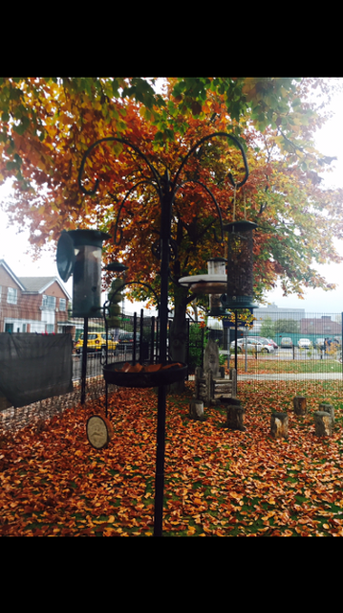
I edited this first photo because I liked the bird feeder and how all the leaves were on the floor but I think it was to dull so using the app Instagram editor I edited the photo. Firstly I went on to the effects and I tested a few out. The ones I tested were Clyde, haas, and lucky. Then I decided to do avenue because it made the colour of the leaves stand out a bright red/orange colour and it reminds me of autumn. After that I then clicked on enhance I tried out some more effects like food, hi def, and scenery. I thought food looked the best so I chose that one. After I cropped the photo down to 4:6. Then I went onto adjust and changed the brightness and saturation. I tried to blur out the background however I did not really liked how it looked so I decided to leave it.


BEFORE:

AFTER:

Autumn Photos Editing Process - Photo 2
In this editing process I did not really do that much. Firstly I tried some different effects until I found the one that I wanted. Then I played around with the hue, saturation, brightness and contrast and added a few more effects.


Analysis:
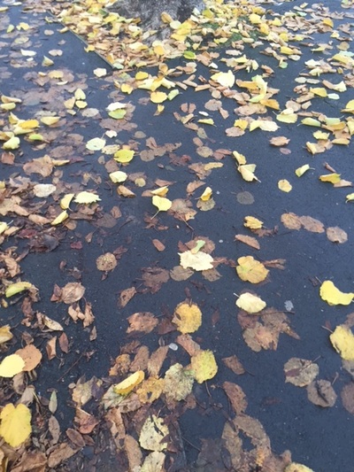
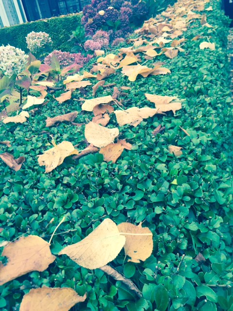
Worst Photo: In my opinion this is the worst photo from my autumn shoot because firstly the photo does not look very nice, it looks quite dull and makes me feel miserable which is I think is because of the lack of colour in the photo. I think I needed to capture the bright, fiery colours of autumn instead of the brown nasty leaves. The photo looks a bit dirty as well because of the leaves in the puddle. The photo is a little under exposed because of the weather as it was dull and raining. I do not really think that this image captures the beauty of autumn which is why I do not really like it.

Worst Photo: In my opinion this is the worst photo from my autumn shoot because firstly the photo does not look very nice, it looks quite dull and makes me feel miserable which is I think is because of the lack of colour in the photo. I think I needed to capture the bright, fiery colours of autumn instead of the brown nasty leaves. The photo looks a bit dirty as well because of the leaves in the puddle. The photo is a little under exposed because of the weather as it was dull and raining. I do not really think that this image captures the beauty of autumn which is why I do not really like it.
Best Photo: In my opinion I believe that this is one of the best photos from my Autmn shoot. I really like the angle of the photo and I think that the photo is in focus. I think that the exposure is just right as well. I like all of the colours in the photo as they represent Autmn. Overall I really like this photo and I think it looks quite good.

Best Photo: In my opinion I believe that this is one of the best photos from my Autmn shoot. I really like the angle of the photo and I think that the photo is in focus. I think that the exposure is just perfect for the photo as well.. I like all of the colours in the photo as they represent Autmn. Overall I really like this photo and I think it looks quite good. With some more editing it could look even more better.
Manchester Architecture:


Edited Photos:
For these edited photos below I did not do that much to them. All I did was played around with the hue and saturation by either increasing or decreasing it and I also played around with the brightness and contrast by either increasing or decreasing it. I also added an effect called Mosaic Tiles and Texturizer.


|
|

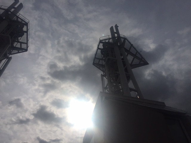
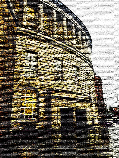
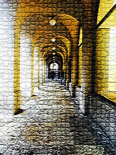
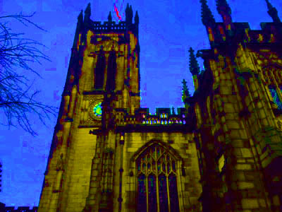
BEST PHOTO: In my opinion my first shoot is not as good as I would of liked it to be but this photo is pretty good I think. Firstly I like how the photo is in black and white as it creates quite a dark and mysterious feeling, the effect also helps the picture stand out The branches in the photo make it look even more mysterious as they stick out in front of the photo. I quite like the angle of the photo as well, it is in a different composition. The shape of the building is quite different, there are parts which are rectangular and at the top it is triangular. The photo also has quite a rough texture to it, I think if you were to touch it, it would be quite sharp. There is also a few patterns in the photo, the windows repeat them self consistently in a line. I think the exposure is just right for the photo as well.

BEST PHOTO: I think that this is a pretty good photo for my first shoot. Firstly I think that the exposure is fine for the photo. The main reason I have chosen this as one of my best photo's is because of all the different types of architecture you can see. In the photo there is at least 4 different types of buildings and I think that they all compliment each other. My favourite building is the one in the centre, I really like the shape of it, it looks pretty sharp and because of the way the photo was taken it splits up the building behind it. I also really like the shape of the building behind it, you can clearly see all of the edges which makes the photo look sharp. The photo looks as if it has a rough texture to it, most likely because of the shapes of the buildings. Overall the photo is quite dull so if I was to take it again I would try taking it on a sunny day.

WORST PHOTO: In my opinion this is one of my worst photos from my first shoot. Firstly as you can tell the photo is clearly very out of focus, you cannot really see much in the photo.; I think I must of moved my phone whilst taking this photo which is why it is out of focus. Also I think that the photo is too dull, I used a monochrome filter whilst taking this photo which I should not have.
Christmas In Manchester...


Edited Photos:
For these edited photos below I did not do that much to them. All I did was played around with the hue and saturation by either increasing or decreasing it and I also played around with the brightness and contrast by either increasing or decreasing it.


|
|
Analysis:
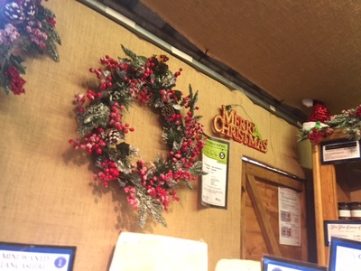
Worst Photo: The reason I have chosen this photo as my worst is because although it says 'Merry Christmas' I do not think it expresses Christmas enough. The photo does not really have anything that makes me think wow it just seems a little bit bland. The exposure is okay however I think if there was some more light and bright colours it would really make the photo stand out even more. Some parts do represent Christmas however there is not really any visible and clear patterns or shapes. I think that the angle is wrong as well as there is not much too look at it would of been better if I took it straight on. The photo was taken in the daytime however it was not really a sunny day, it was quite gloomy which had a impact on the photos. When taking all of these photos I really realised how much of an impact the weather can have on a photographer. I do no really like the photo.
Worst Photo: In my opinion I believe that this is the worst photograph from my Christmas in Manchester shoot. Firstly the photo is very out of focus, the camera might have been shaking when I took the photo. Also the angle of the photo is not good for the photograph and I believe that the photo does not really represent Christmas in Manchester as you can not really see anything in the photo. The photo does look boring and it does not make me feel happy like a normal Christmas picture does. In my opinion this photo is not very good and that is why I do not like it.
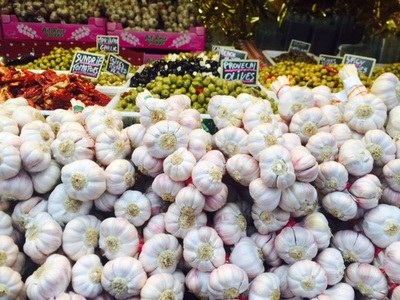
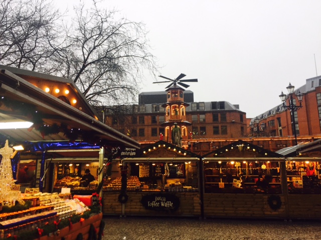
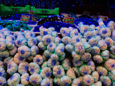
Best Photo: In my opinion this is one of my best photos from my christmas in Manchester shoot. Firstly I really like how all of the colours in the photo blend together really well as it makes the photo stand out even more. I also like how the main focus is on the garlic and the rest of the food is a little bit out of focus as it makes the photo look better. I also think that the angle for the photo is really good and I believe that the exposure of the photo is just right for the photo. Although the photo does not really represent Christmas I still like it.
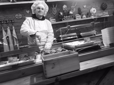
Best Photo: This is another one of my favourite photos from my Christmas In Manchester shoot. Firstly I believe that the angle of the photo is good and I think that the photo is in focus which is good. I also think that the exposure of the photo is good. I like how it represents all the nice food you eat on Christmas and as the photo is in black and white it makes the photo look a lot more authentic. Overall I think that this photo is good and I really do like it.
A Splash Of Colour


Edited Photos:
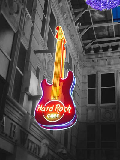
For these edited photos below I did not do that much to them. All I did was played around with the hue and saturation by either increasing or decreasing it and I also played around with the brightness and contrast by either increasing or decreasing it. On the guitar one I selected the background using the magic wand tool and turned the background black and white so the guitar would stand out.


|
|
Analysis:

Worst Photo: In my opinion this photo is not that good which is why I decided to chose it as my worst photo. Firstly the photo does look quite out of focus and there is nothing, I think, to look at in the photo, there is no main focus. Also the angle of the photo is not right, it looks too bent and I think that it needed to be more straight. The photo also looks quite dull maybe because it looks a little under exposed and I think that this makes the photo look quite sad and depressing. There are a lot of different shapes in the building but I think I needed to focus on one to make it look better. Also the photo has quite a rough texture to it which I do not like. There is a little pattern with the colour yellow but it does not stand out so it does not make the photo look any better. Overall the photo is really not good.

Worst Photo: This photo is kind of okay because it captures the yellow colour scheme which I was working on however the reason I have chosen it for my worst photo is because it is quite monotonous. It is dull and boring and it is quite tedious. I also noticed that some part of the photo is a little bit under exposed and dark because the photo was taken under a tunnel. I also think that the photo is not straight as the angle is wrong which is another reason as to why it does not work. The shapes in the photo are not that exciting as they are not really unique or different. Furthermore some part of the photo is chopped off and you can not see the full photo. The photo is not bad however it is not great either and I know that I could of done better.

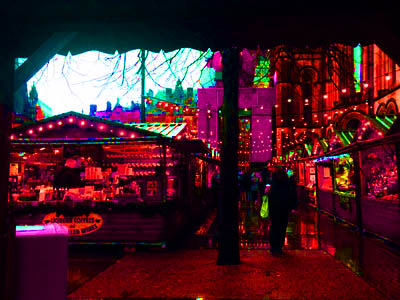
Best Photo: This is one of my favorite photos from my splash of colour shoot. Firstly in my opinion I believe that the angle of the photo is good and I think that the photo is in focus. I also think that the exposure of the photo is just right for the photo. I really like the lights that are coming from the hard rock cafe guitar as well. I think the colours all go together really well and it makes the photo stand out even more. Overall I really like this photo and I think that it is really good.
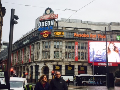
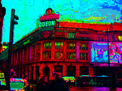
Best Photo: The reason I have chosen this photo as one of my best photos is because of the building behind it. I think that this photo is in focus and clear and I also think that the angle of the photo is good for the photo. I like how you can see all of the building and I also like how you can see the busy streets. This photo is ok however I do think I could of done better.
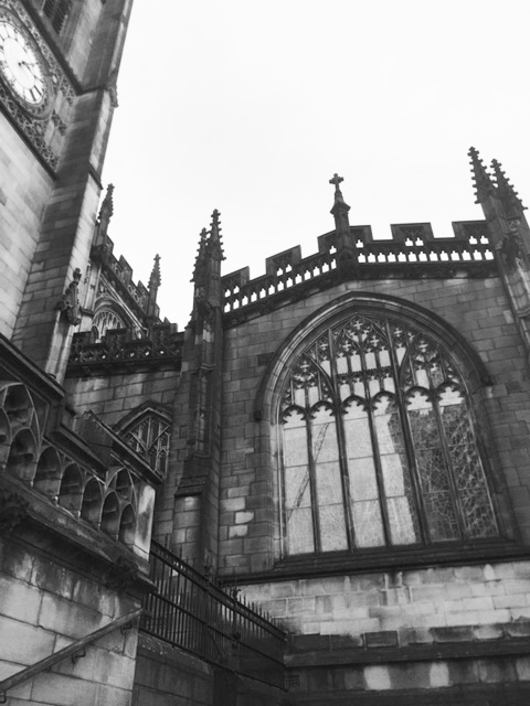
Cathedral


Edited Photos:
For these edited photos below I did not do that much to them. All I did was played around with the hue and saturation by either increasing or decreasing it and I also played around with the brightness and contrast by either increasing or decreasing it.


|
|
Analysis:

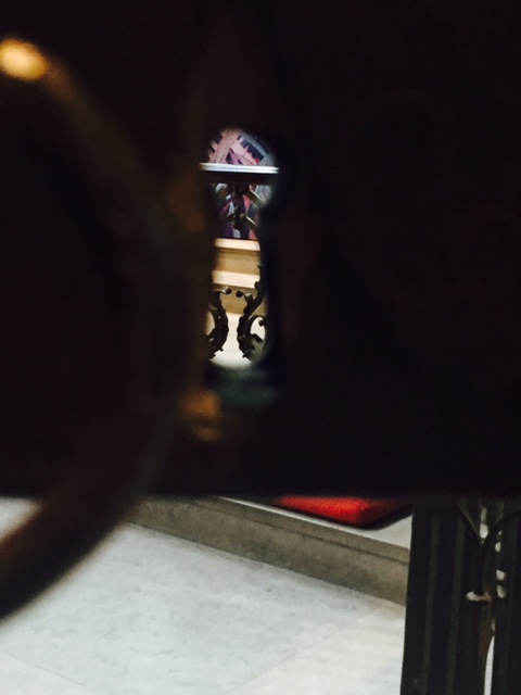
Worst Photo: There were a few bad ones in this shoot however I decided to choose this one as my worst one because firstly the photo is out of focus and it looks bad because there is nothing much to see in the photo. The photo looks as if the camera was shaking whilst I took it and I think that the photo looks quite dull. It would of been better if it was more bright and colorful like some of the other photos with the fiery colours in them like red and orange. I think that the lighting in the photo is bad and the photo does not really show anything which makes it look quite dull and boring. The shiny part on the top makes the photo look a bit weird as it does not go with the rest of the photo. Overall the photo is quite monotonous which is why I do not really like.

Worst Photo: In my opinion I believe that this is the worst photo from my cathedral shoot. Firstly the photo does not really so much which makes it quite boring. Also I do not like how the light is coming through as it does not add anything to the photo and it is quite distracting. I think that the angle of the photo is all wrong and some parts of the photo seem over exposed and other parts seem underexposed. Overall this photo is not good and I do not like it.
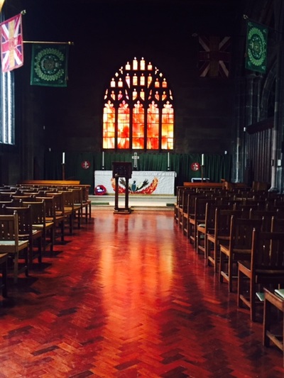
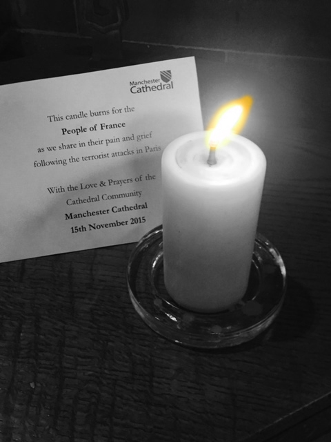
Best Photo: In my opinion I believe that this is one of the best photos from my cathedral shoot. Firstly I believe that the angle of the photo is good and I think that the photo is in focus which is good. I also think that the exposure of the photo is good. One of my favourite things in this photo is the colours. As the colours are reds, yellows and orange it gives the photo a fiery and hot feeling which I really like. I also love the stained glass window at the back of the photo and I like how you can see the light on the floor as well. Overall I really like this photo and I think that it is good.

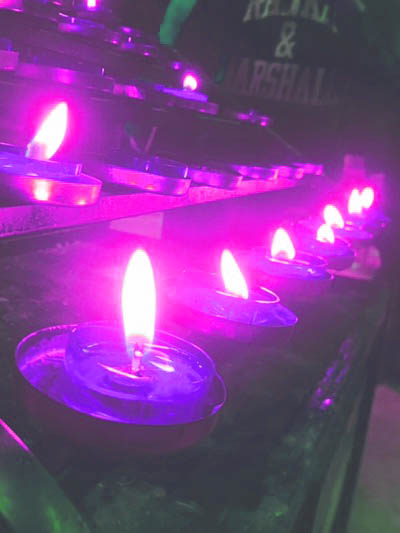
Best Photo: This photo is one of my best photos and I really do like it. The first thing I like about the photo is the angle and composition of the photo, I like how I have managed to get all of the candles in the photo and I like how the photo is clear and in focus. I also like how the background of the photo is pretty dark and how the light from the candles light it up. The best thing in my opinion of this photo is the colours of the photo, I like how it gives a fiery and warm feeling to the photo. I really like this photo.
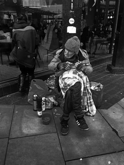
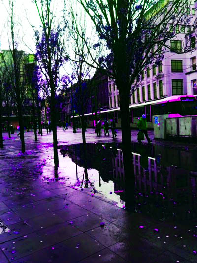
Hustle and Bustle:


Edited Photos:
For these edited photos below I did not do that much to them. All I did was played around with the hue and saturation by either increasing or decreasing it and I also played around with the brightness and contrast by either increasing or decreasing it.


|
|
|
Analysis:

Worst Photo: This photo is really bad and I think that is mainly because of how out of focus the photo is and how the photo looks very shaky. The exposure of the photo is okay but there is no shapes or nothing interesting to look at in the photo which makes it very boring. I do not think it captures the busy streets of Manchester like it is supposed to. There is not any patterns in the photo as well, I think that I just took the picture with out really thinking about what I want to capture which is why it looks bad. The angle of the photo is bad as well.

Worst Photo: I believe that this is the worst photo from my hustle and bustle shoot. This photo firstly does not show the busy streets of Manchester as I have just taken the photo of the floor and a shop window. The angle of the photo is very wrong and the photo has no main focus. I also do not like how the light is shining through as it does not add anything to the photo. Overall this photo is really bad and I do not like it.

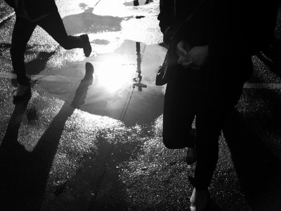
Best Photo: In my opinion this is one of the best photo from my hustle and bustle shoot. Firstly in my opinion I believe that the angle of the photo is good and I think that the photo is in focus. I also think that the exposure of the photo is just right for the photo. I really like how I managed to capture a reflection in the puddle and I really like it.

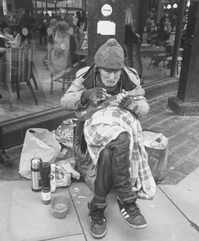
Best Photo: In my opinion this is one of the best shoots from my hustle and bustles shoot. I really like it as it represents what you see everyday in the streets, which is busking in the streets. I also like how the photo is in black and white as it makes the photo look a lot more authentic. I think that the angle for the photo is just right and in my opinion I believe that the photo is in focus. Even though there is not a lot happening in the photo I like how simple it is and how the main focus is on the person, I do like this photo a lot.


